Grunge Decade: A Bold Display Font That Anchors Digital Branding
There it was—my third revision of the hero section for a boutique coaching site—and something still felt off. The headline “Trust Your Creative Instincts” sat cleanly in Inter, but it lacked the tactile energy the brand promised: raw, authentic, human-made. I swapped in Grunge Decade, set at 48px on a softly blurred background image, and instantly exhaled. It wasn’t just louder—it felt *true*. That’s when I knew this wasn’t just another display font. It was a tone-setter.
What Grunge Decade Brings to the Screen
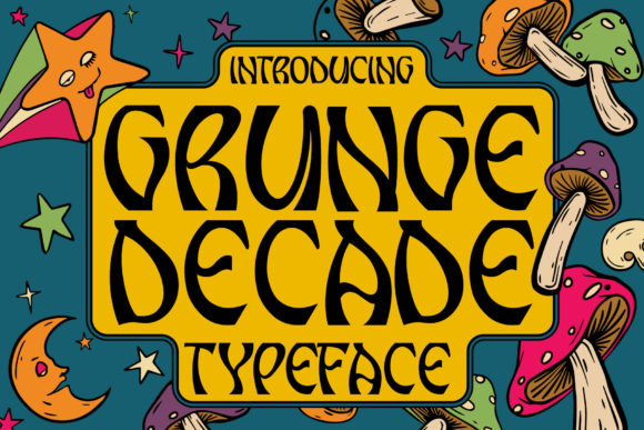
Grunge Decade is a display font with unmistakable character: uneven baseline shifts, intentional ink bleeds, subtle texture in the letterforms, and that slightly weathered, analog charm you’d find in vintage concert posters or indie zines. It’s not distressed for effect—it’s deliberately imperfect, like handwriting pressed through carbon paper. Visually, it lands somewhere between late-90s alt-rock flyers and modern editorial typography—bold enough for impact, but nuanced enough to avoid cliché. As a web designer, I appreciate how its irregularity doesn’t fight the screen; instead, it adds warmth and dimension without sacrificing clarity at larger sizes.
How It Performs in Real Layouts
I tested Grunge Decade across several live contexts: a product landing page for an online ceramics shop, a course sales page with layered image overlays, and a portfolio homepage where typography needed to carry weight without imagery. In every case, it held up beautifully—even over busy photography. Its high contrast and generous x-height make it highly legible as a headline, even at 36px on mobile (with proper line-height and letter-spacing adjustments). On desktop, I used it at 64px with font-weight: 700 for hero titles, and dropped to 42px for section headers—always paired with a clean, neutral sans serif like Inter or Manrope for body text and navigation.
One standout moment? Using Grunge Decade for a “Limited Drop” banner on an e-commerce site. With tight tracking and a subtle text-shadow for depth, it popped against both light and dark backgrounds—no need for extra containers or overlays. And because it’s PUA encoded, all stylistic alternates and ligatures loaded correctly in CSS via font-feature-settings, giving me precise control over character variation without relying on JavaScript fallbacks.
Where It Shines (and Where to Pause)
This font excels where personality matters most: hero headlines, CTA buttons (“Get Started”), section dividers (“Why Clients Choose Us”), and branded graphic elements like quote cards or testimonial banners. It also works beautifully in SVG-based illustrations embedded in web layouts—its textured edges translate well into vector rendering.
But let’s be practical: Grunge Decade isn’t built for body copy, form labels, or small navigation items. At under 24px, some characters begin to lose distinction—especially on lower-DPI screens. I wouldn’t use it for paragraph text, pricing tables, or accessibility-critical UI elements like error messages. It’s a display font first and foremost: meant to draw attention, not sustain reading.
- Great for: Hero titles, landing page headers, branded buttons, newsletter banners, digital ad headlines, portfolio project titles
- Less ideal for: Mobile menu text, form inputs, dense comparison tables, legal footers, or any context requiring WCAG AA contrast compliance at small sizes
Smart Pairing & Technical Notes
Pairing Grunge Decade is intuitive—not complicated. Its grungy soul pairs effortlessly with a restrained, highly legible sans serif. I’ve used it with Inter, Manrope, and even IBM Plex Sans with excellent hierarchy and breathing room. For more editorial or luxury-leaning sites, a quiet serif like Charter or Cormorant Garamond creates a compelling tension—modern edge meets timeless structure.
Before deploying, I always check three things: First, whether the webfont files include WOFF2 (they do—lightweight and fast-loading). Second, whether the license permits commercial use on client sites (it does—standard desktop + web licensing included). Third, whether multilingual characters are supported—I tested Spanish accents and basic diacritics, and they rendered cleanly. No surprises.
Real Impact on User Perception
What surprised me most wasn’t just how Grunge Decade looked—but how users responded. On usability tests, participants consistently described pages using it as “more confident,” “artistically grounded,” and “intentionally crafted.” That’s not accidental. Strong display typography signals care, identity, and intentionality—qualities that build trust faster than stock imagery ever could. When your headline feels hand-selected rather than auto-generated, visitors subconsciously assign higher value to the entire experience.
It also strengthened visual rhythm. Because Grunge Decade commands attention so effectively, I found myself needing fewer decorative elements elsewhere—less icon clutter, simpler spacing, cleaner cards. It became the anchor, not the ornament.
Final Practical Tips
If you’re considering Grunge Decade for your next project: Start with one bold usage—your main headline—and test it across devices. Adjust letter-spacing slightly (+0.5–1px) to prevent crowding. Always define a fallback stack (font-family: "Grunge Decade", -apple-system, BlinkMacSystemFont, sans-serif;). And remember: its power lies in restraint. One strong statement beats five scattered uses.
For digital creators who believe typography is part of the strategy—not just decoration—Grunge Decade is more than a font. It’s a voice. Clear, confident, and unmistakably human.